Pastels, in all their glory, are having a moment in the spotlight. They are perfect for adding subtle interest for the summer months. These pops of colour are ready to transform your space!
There are a range of pastel designs to choose from for your next blind. From sprawling natural prints to subtle plains, the options are endless. Their light and delicate nature make them especially versatile too. They complement a range of styles, from traditional spaces to contemporary interiors. Find plenty of inspiration below.
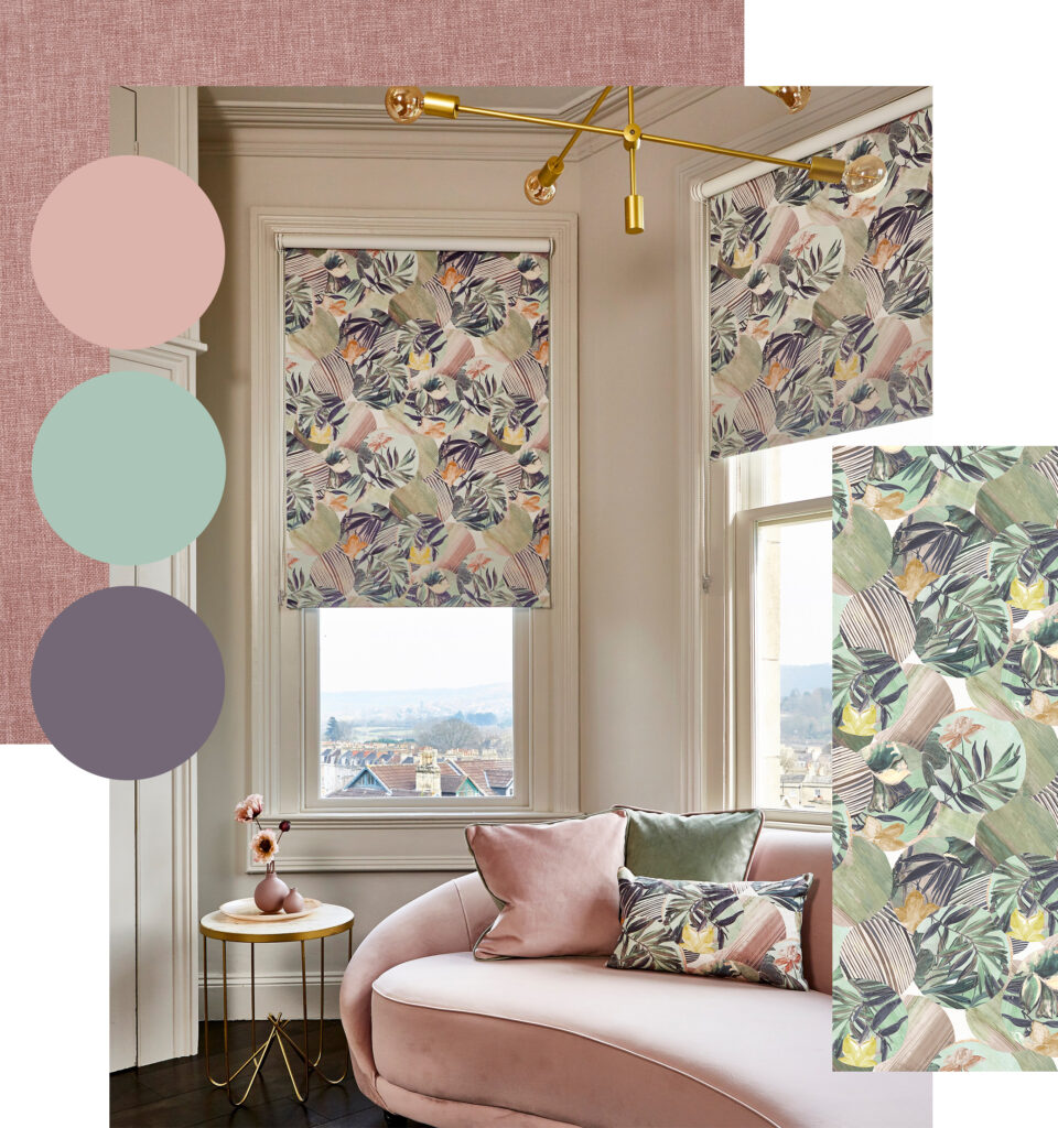
Use a Conversational Print Inspired by Nature
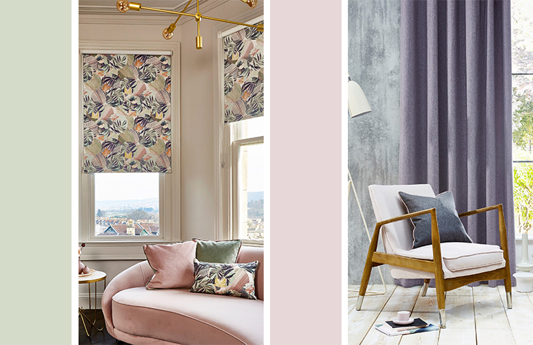
Pastels go hand-in-hand with botanical designs. The two create dreamy, calming spaces perfect for summer.
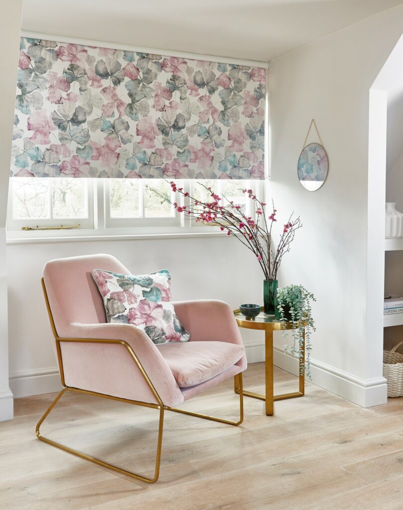
Florals look especially charming in pastel shades. Use roller blinds to present designs. These are ideal for showcasing pattern thanks to their single piece of fabric. Similarly, palm prints in dusky colourways create a relaxed feel. Powder pink, tropical florals look particularly striking too. Instead, why not use a charming seashell design in seafoam?
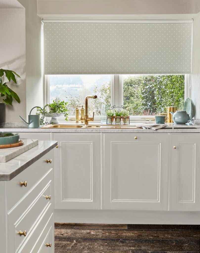
Plain Pastel Designs are Simple Yet Effective
Sometimes, all you need is a plain fabric to add that much needed pop of character.
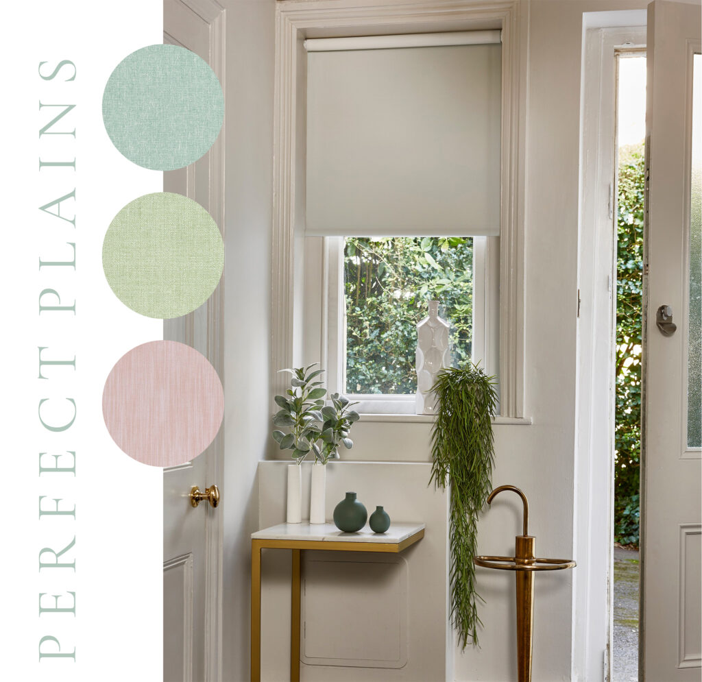
Create calm with a fresh, uplifting colourway. Plain designs are ideal for breaking up pattern. They are effective at stopping rooms from becoming too busy too. Use a textured plain on a Roman blind or curtain for subtle interest. Blackout designs are perfect for spaces such as bedrooms. These provide effective light control where it’s needed most.
Combine with Richer Colours for Added Impact
Make pastel palettes pop by pairing with more saturated shades.
Darker colourways can add much-needed depth in otherwise light schemes. Combining the two creates balance. Use variations of the same shade for cohesion. Team a more delicate pink roller blind with richer purple accessories, for example. Combine nature-inspired hues together, such as a pretty pink with a verdant green.
Use Different Hues for Various Spaces
Consider the area in your home when choosing which pastels to use.
Consider whether your space is designed for relaxation or not. For example, we would recommend using a fresh, bright blind in a kitchen or living area. Pistachio greens and butter yellows are ideal for this. In bedrooms and spaces where rest is essential, use a more muted shade such as a gentle pink or lavender. Use a Roman blind in your bedroom for added cosiness. Pair with a blackout lining for the ultimate restful space.
Find endless pastel inspiration in our product search
Locate your nearest stockist here
Discover our latest Pinterest board for more inspiration